
Jeanette Mendez
Four different graphic design projects
Graphic Design Work


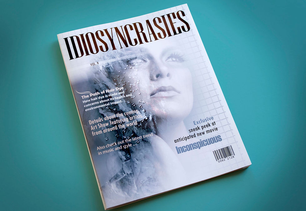
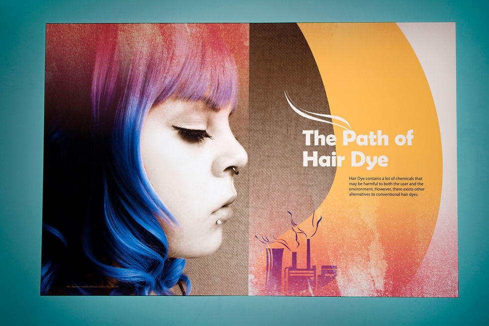
Idyosyncrasies Magazine:
An original magazine titled 'Idiosyncrasies' that covers different cultural, and artistic aspects. Idiosyncrasies would be heavily based on graphics. I edited photos for Idiosyncrasies magazine cover and cover spread. I also created cohesive icons that demonstrate the path of commercial hair dye.

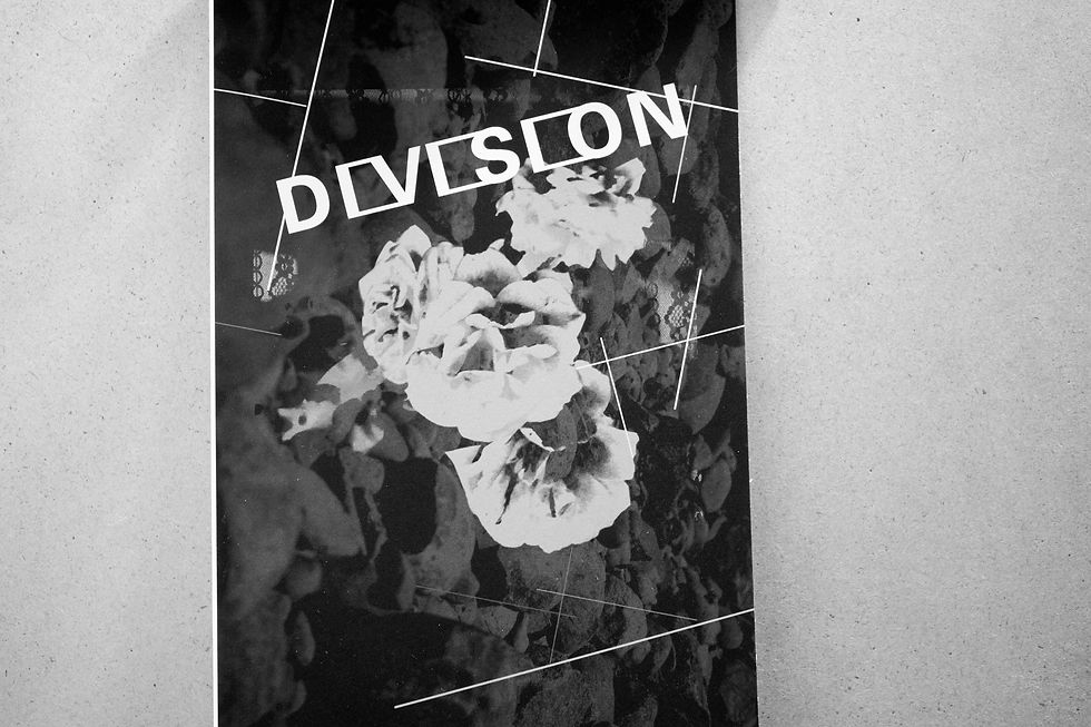
DIVISION:
With the word division I created a logotype. The logotype was then used as the name of a black and white photo gallery exhibit.
I created a poster and a booklet while I both photographed and edited the images used.
The event to advertise was Open Studios, an end of the year event where students display their work. Since the event was held on a Friday Thirteen, the theme was superstitions. I created both a poster and a booklet, one to advertise the event, the other to design a book around the concept of superstitions.
Friday 13:

The word is written in acrylics and just like the meaning of the word AVOID, the white word is 'avoided' by the black brush strokes.
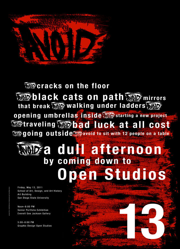
12 things to avoid 13

The word is written in acrylics and just like the meaning of the word AVOID, the white word is 'avoided' by the black brush strokes.
#2
#1
#3
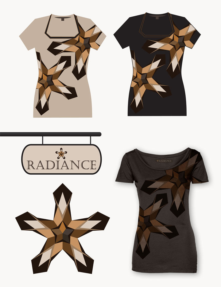
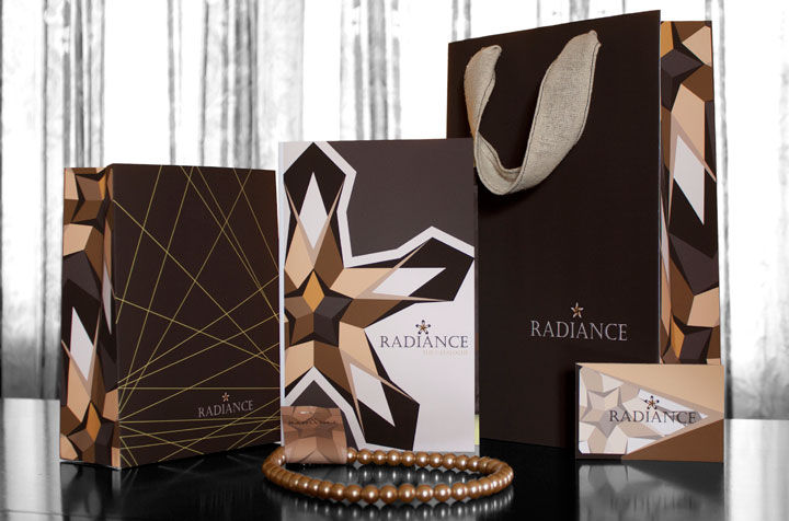
A boutique's logo and identity was created by using the basic shape of a star. Thus the boutique is named 'Radiance' and would specialize in women's fashion exhibiting elegance.
RADIANCE:

#4